.avif)
Rosokha.

The DeFi space is saturated with platforms that look overly technical, generic, and visually interchangeable.
Kopeion needed a distinctive identity that would:
- Connect clearly to lending and security
- Stand apart from utilitarian crypto aesthetics
- Build cultural depth without feeling outdated
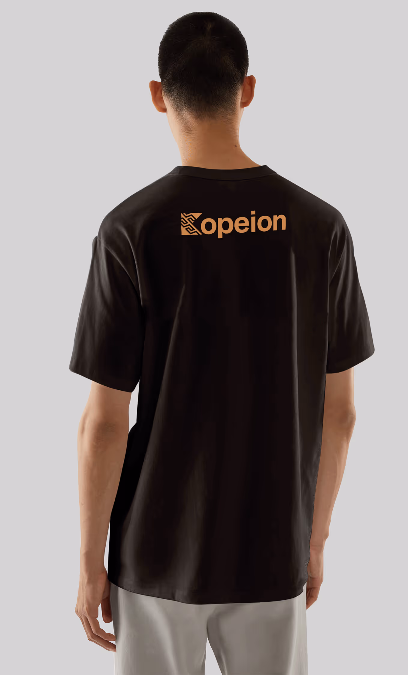
- Work seamlessly across product, UI, and marketing
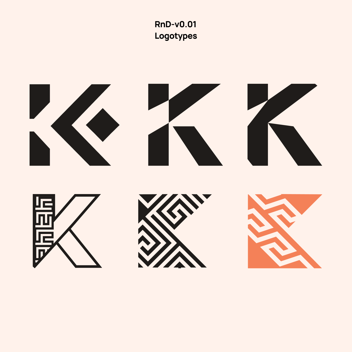
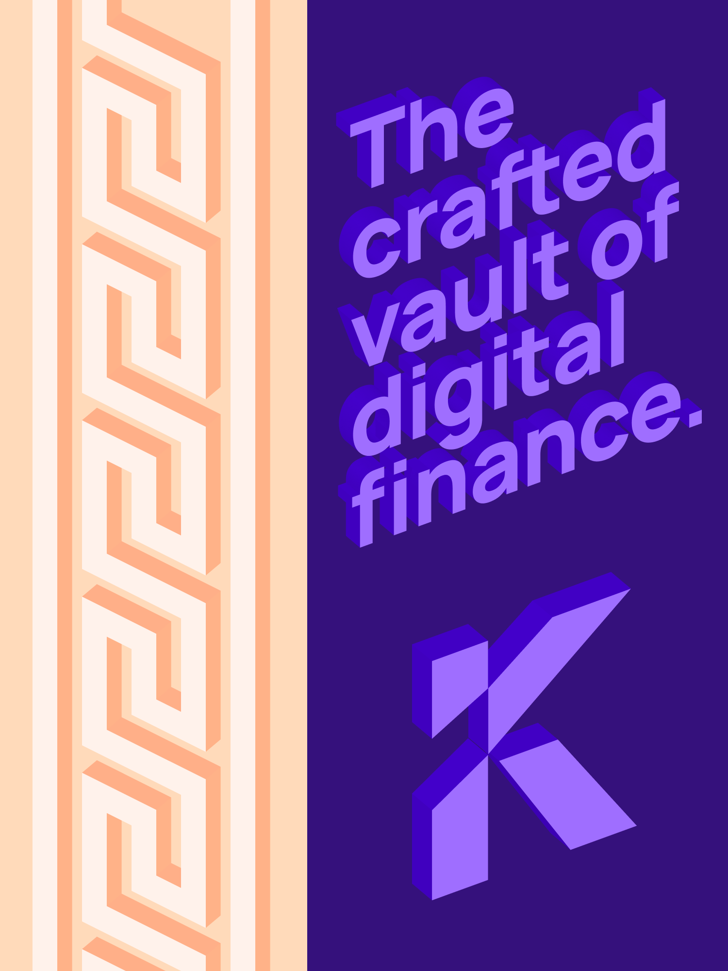
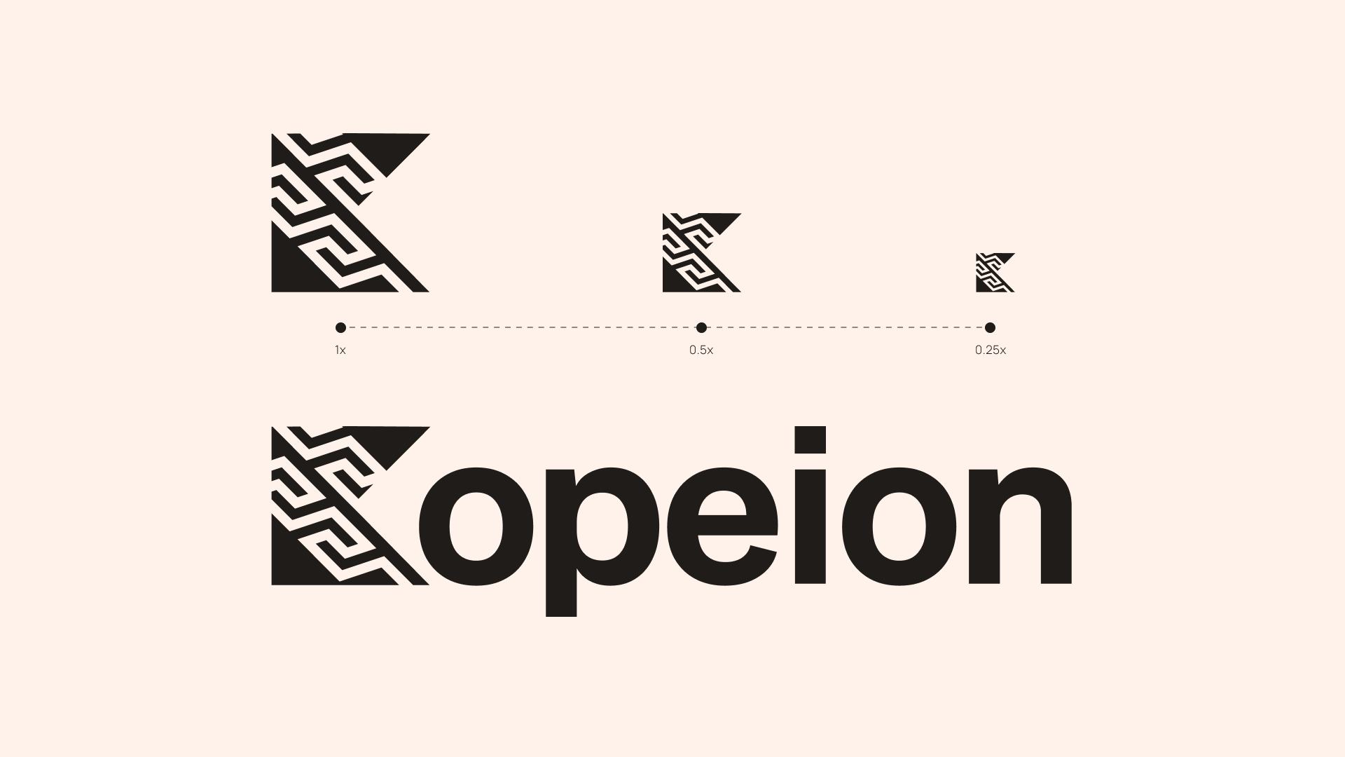
The brand was built around the concept of coin minting — a direct reference to value creation and security.
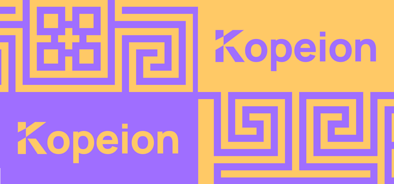
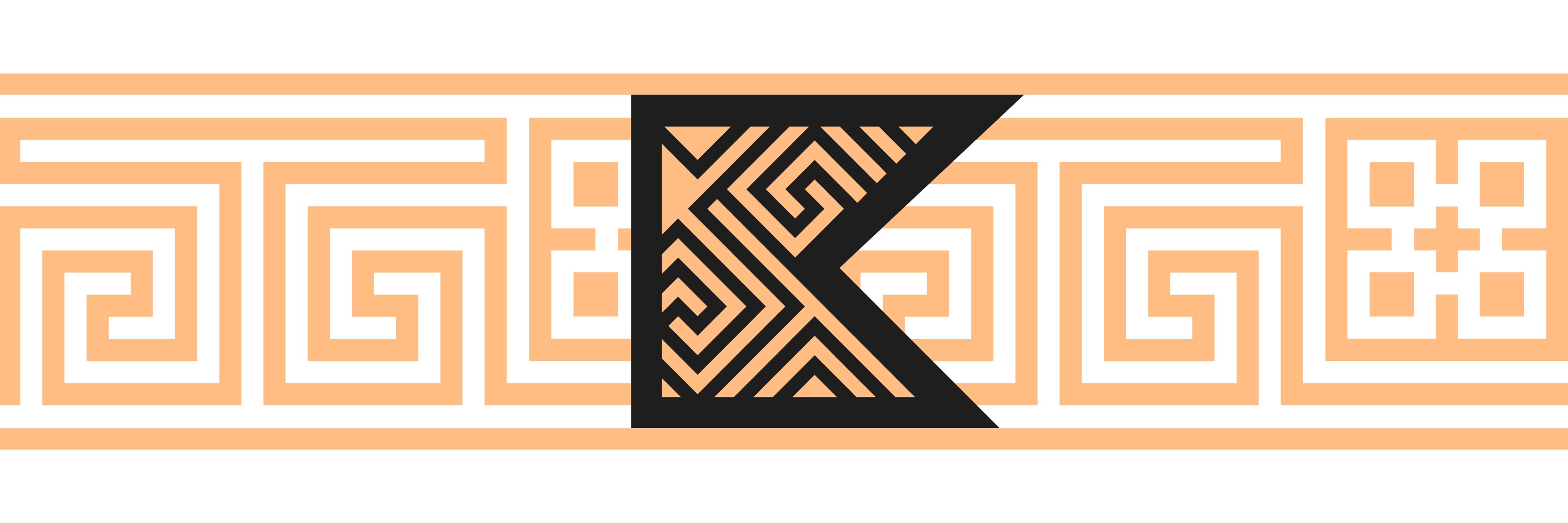
Inspired by Greek coin production (“kopeion” as minting place), the visual system merges:
- Coin symbolism
- Greek-inspired patterns
- Terracotta and accent color logic
- Abstract modern structures
- Clean, flexible typography
The goal was to create a lending platform that feels secure, refined, and memorable — not just functional.
As a result of brand creation, I:
- Positioned Kopeion with a differentiated identity in a saturated DeFi market.
- Built a scalable visual framework to support long-term product and marketing development.
- Increased brand clarity and recognition through a structured design system.
.png)
.avif)
.avif)
.avif)
.avif)
.avif)
.avif)
.avif)
